Most people choose event colours the same way: they see a photograph they like and ask for those colours. Then the room does not look like the photograph, and nobody can explain why. Here is a method that works more reliably.
Start with a feeling, not a colour
Before you name a single colour, finish this sentence: when people walk in, I want them to feel —. Warm and welcoming. Cool and elegant. Bold and celebratory. Soft and romantic.
That word does more work than a colour name. "Burgundy and gold" can be opulent or funereal depending entirely on execution. "Warm, rich, celebratory" tells your decorator what you actually want and lets them get you there with the materials that are genuinely available.
Use the 60/30/10 rule
The most useful borrowed idea in event design, straight from interiors:
- 60% dominant — your linens, drapery, the large surfaces. Usually the quietest colour.
- 30% secondary — chair treatments, runners, the bulk of your florals.
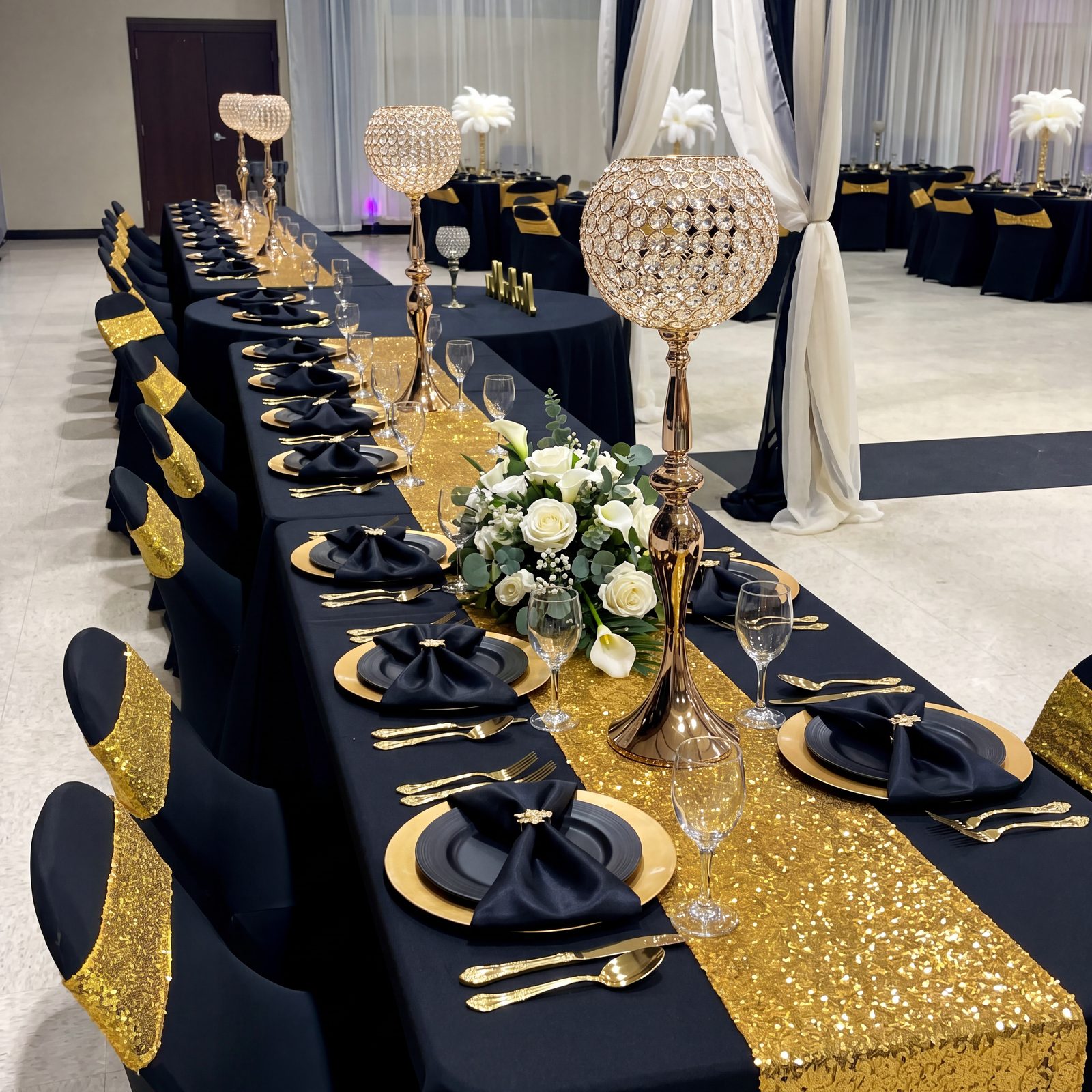
- 10% accent — metallics, candles, stationery, the one bright note.
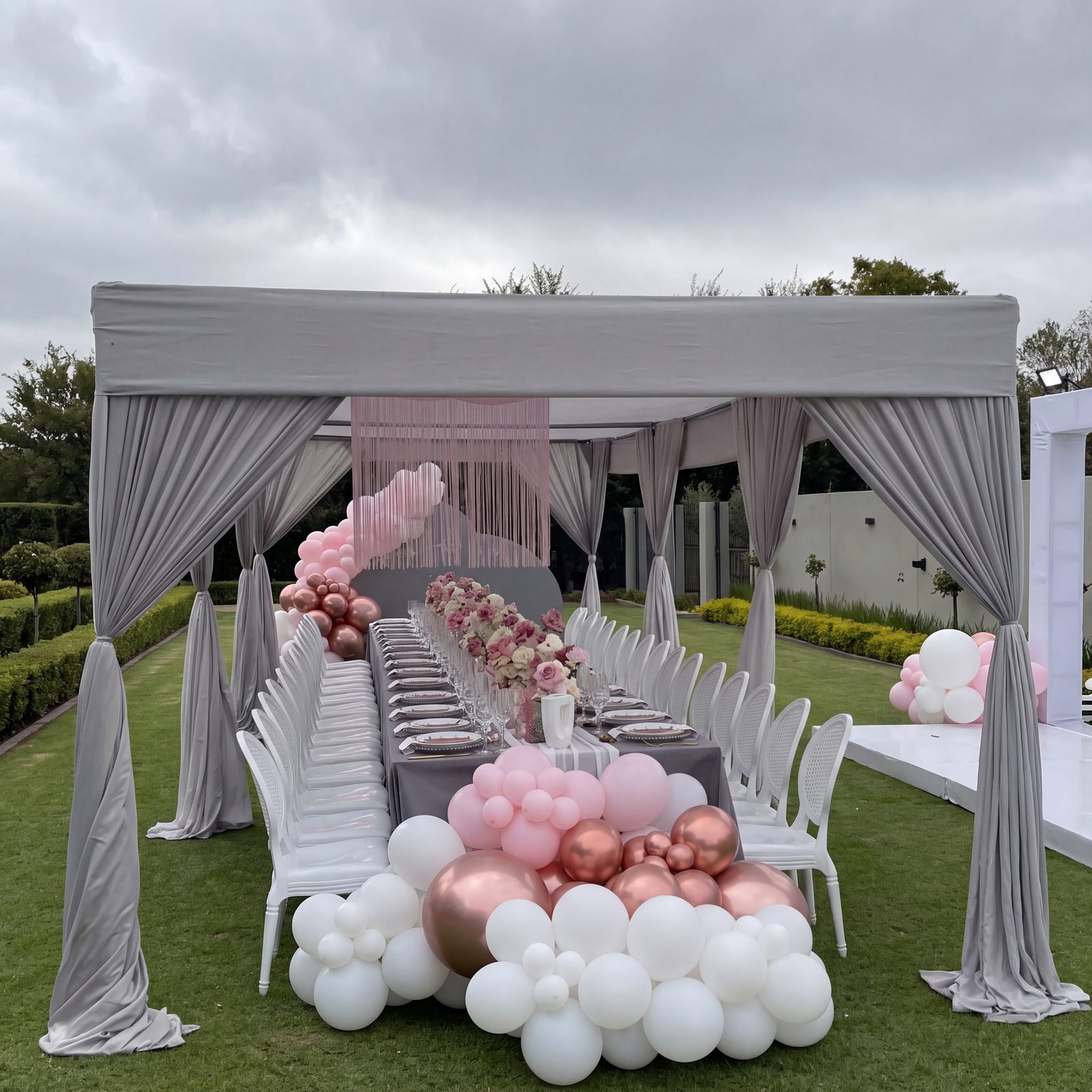
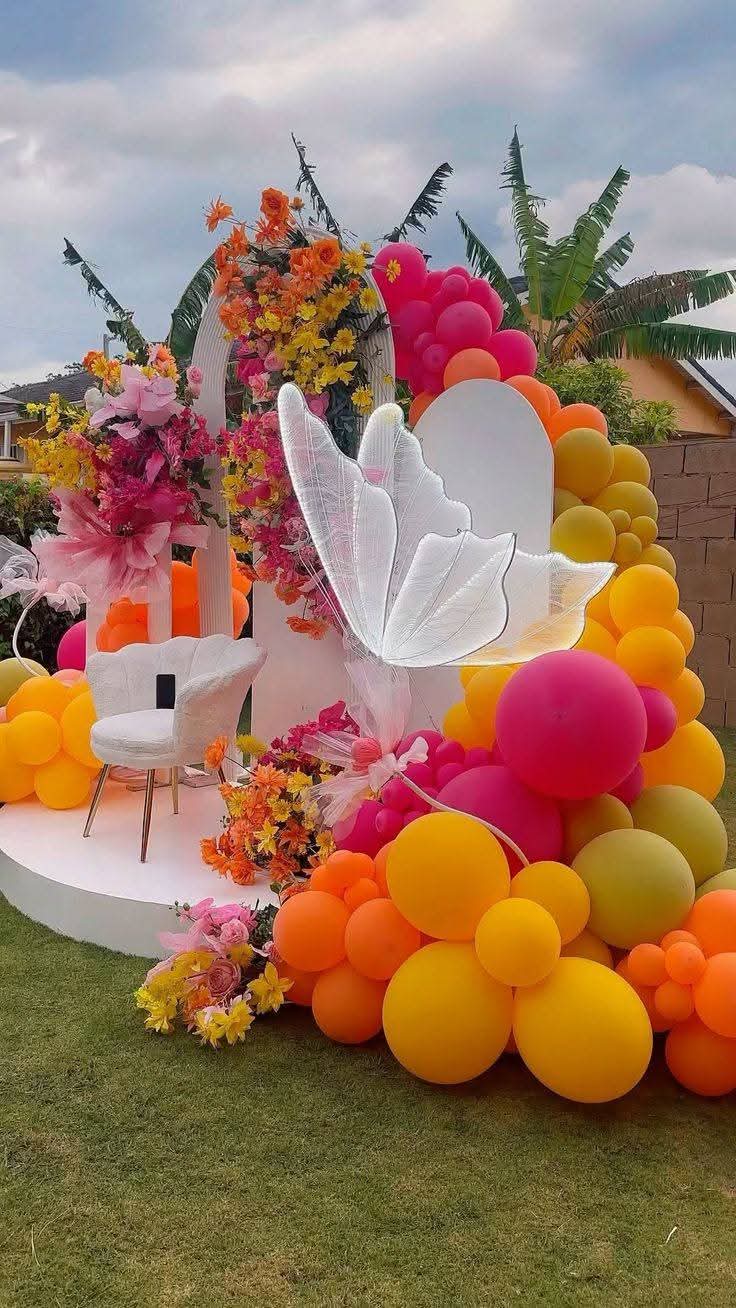
The mistake almost everyone makes is inverting it: choosing the exciting colour as the dominant one. A room that is 60% hot pink is exhausting after twenty minutes. A room that is 60% soft blush with hot pink at 10% is the effect you were actually imagining.
Your venue already has a colour — work with it
This is the step people skip, and it is the one that ruins palettes. Walk your venue and write down what you cannot change: the carpet, the curtains, the wall finish, the chairs if they are fixed, the ceiling.
A hall with a deep red patterned carpet has already made a decision for you. You can fight it, expensively and usually unsuccessfully, or design around it. Many Lagos event centres have strong existing colour — knowing this before you fall in love with sage green saves a great deal of money and disappointment.
Test your palette in the actual light
Colour behaves completely differently under Lagos afternoon daylight, under warm evening uplighting, and under a venue's default fluorescents. A palette that sings in a daylight garden ceremony can go grey and muddy in the same colours indoors at eight in the evening.
If your event runs from afternoon into evening, check both. And never approve a colour from a phone screen — every screen lies, in a different direction. Ask for physical swatches: the actual fabric, the actual ribbon, the real flowers if the season allows.
Two colours that look perfect together on a phone can clash badly on real fabric. Always ask for the swatch.
Think about the people in the photographs
Your guests and your family are going to be standing inside this palette all day. Some colours flatter a wide range of skin tones under warm light and some drain them. Deep jewel tones, warm neutrals, rich earth tones and most metallics photograph beautifully against darker skin. Very pale cool pastels and certain yellow-greens can go flat.
This matters most for whatever is directly behind people in photographs — your backdrop, your top table, your photo corner. Get that one right and the rest has room to be adventurous.
Where flowers actually limit you
Not every colour exists in a flower, and not every flower is available in Lagos every month at a sane price. True blue is genuinely difficult. Certain precise shades only come from dyeing, which reads differently up close.
Tell your decorator your palette early and ask what is realistically in season. A good team will offer you a near-match that is available and beautiful, rather than promising an exact shade and quietly substituting on the day.
Common mistakes
- Too many colours. Three is plenty. Four is a stretch. Five is a children's party, which is fine if that is the event.
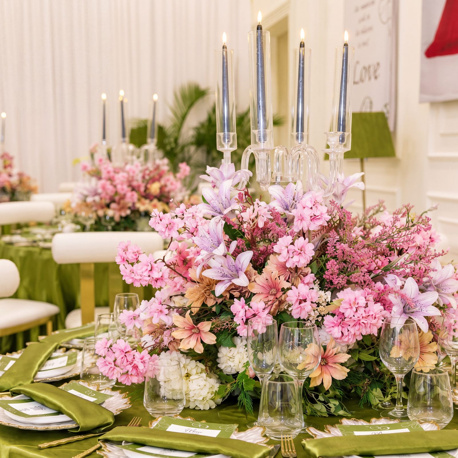
- Matching everything exactly. A room where every element is the identical shade looks flat. Vary the tone within your colour.
- Forgetting the food. The dining table is a major colour surface. Jollof rice is a strong orange-red and it is going to be in your photographs.
- Ignoring the entrance. The first three metres set the expectation for everything after. Do not save the budget for the far end of the room.
A quick way to sanity-check
Put your three colours side by side, in roughly the 60/30/10 proportions you plan to use, on a physical surface, in the light you will actually have. If it still looks right, it will look right at scale.
Stuck between two directions? Send us both — tell us your venue and your date, and we will tell you which one will actually work in that room.

The Ma'jestik Events Team
We plan, decorate, cater and staff events across Lagos — from our office at 16 Shobande Street, Akoka, Yaba. More about us.